Avatar - Laravel Blade
Use the avatar component to show a visual representation of a user profile using an image, initials, or a placeholder icon.
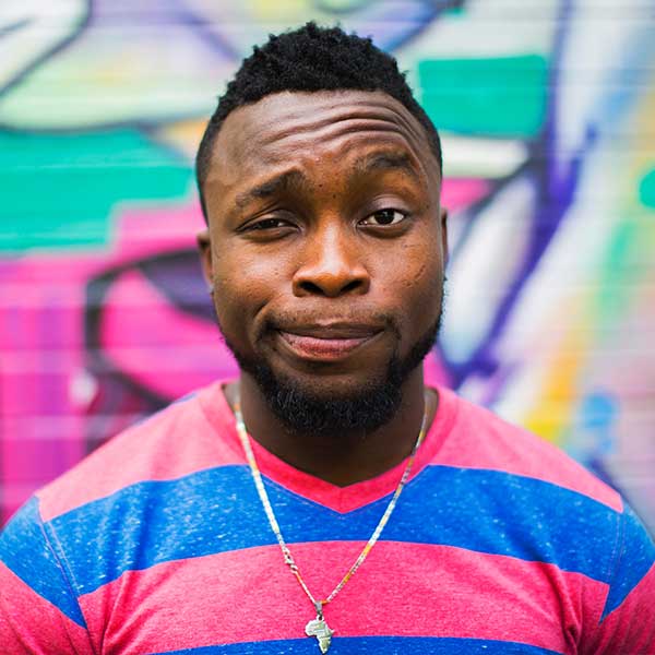
Default Avatar

Blade code
<div class="flex items-center gap-4">
    <x-fwb.avatar src="https://flowbite.com/docs/images/people/profile-picture-5.jpg" alt="User avatar" />
    <x-fwb.avatar />
</div>
Rounded and Square
Blade code
<div class="flex items-center gap-4">
    <x-fwb.avatar src="https://flowbite.com/docs/images/people/profile-picture-5.jpg" :rounded="true" />
    <x-fwb.avatar src="https://flowbite.com/docs/images/people/profile-picture-5.jpg" :rounded="false" />
</div>
Bordered Avatar
Blade code
<div class="flex items-center gap-4">
    <x-fwb.avatar src="https://flowbite.com/docs/images/people/profile-picture-5.jpg" :bordered="true" />
    <x-fwb.avatar src="https://flowbite.com/docs/images/people/profile-picture-5.jpg" :bordered="true" :rounded="false" />
</div>
Placeholder Icon
Blade code
<div class="flex items-center gap-4">
    <x-fwb.avatar />
    <x-fwb.avatar :rounded="false" />
</div>
Placeholder Initials
JD
AB
CK
Blade code
<div class="flex items-center gap-4">
    <x-fwb.avatar initials="JD" />
    <x-fwb.avatar initials="AB" size="lg" />
    <x-fwb.avatar initials="CK" :rounded="false" />
</div>
Dot Indicator
Blade code
<div class="flex items-center gap-4">
    <x-fwb.avatar src="https://flowbite.com/docs/images/people/profile-picture-5.jpg" status="online" statusPosition="top-right" />
    <x-fwb.avatar src="https://flowbite.com/docs/images/people/profile-picture-5.jpg" status="busy" statusPosition="top-right" />
    <x-fwb.avatar src="https://flowbite.com/docs/images/people/profile-picture-5.jpg" status="offline" statusPosition="bottom-right" />
    <x-fwb.avatar src="https://flowbite.com/docs/images/people/profile-picture-5.jpg" status="away" statusPosition="bottom-left" />
</div>
Avatar Sizes
Blade code
<div class="flex items-center gap-4">
    <x-fwb.avatar src="https://flowbite.com/docs/images/people/profile-picture-5.jpg" size="xs" />
    <x-fwb.avatar src="https://flowbite.com/docs/images/people/profile-picture-5.jpg" size="sm" />
    <x-fwb.avatar src="https://flowbite.com/docs/images/people/profile-picture-5.jpg" size="md" />
    <x-fwb.avatar src="https://flowbite.com/docs/images/people/profile-picture-5.jpg" size="lg" />
    <x-fwb.avatar src="https://flowbite.com/docs/images/people/profile-picture-5.jpg" size="xl" />
</div>
Stacked Avatars


Blade code
<x-fwb.avatar.group :stacked="true">
    <x-fwb.avatar src="https://flowbite.com/docs/images/people/profile-picture-1.jpg" />
    <x-fwb.avatar src="https://flowbite.com/docs/images/people/profile-picture-2.jpg" />
    <x-fwb.avatar src="https://flowbite.com/docs/images/people/profile-picture-3.jpg" />
    <x-fwb.avatar src="https://flowbite.com/docs/images/people/profile-picture-4.jpg" />
    <x-fwb.avatar src="https://flowbite.com/docs/images/people/profile-picture-5.jpg" />
</x-fwb.avatar.group>
Avatar Group
Blade code
<x-fwb.avatar.group>
    <x-fwb.avatar src="https://flowbite.com/docs/images/people/profile-picture-1.jpg" />
    <x-fwb.avatar src="https://flowbite.com/docs/images/people/profile-picture-2.jpg" />
    <x-fwb.avatar src="https://flowbite.com/docs/images/people/profile-picture-3.jpg" />
</x-fwb.avatar.group>
Avatar with Text
Jese Leos
Joined in August 2014
Blade code
<div class="flex items-center gap-4">
    <x-fwb.avatar src="https://flowbite.com/docs/images/people/profile-picture-5.jpg" />
    <div class="font-medium dark:text-white">
        <div>Jese Leos</div>
        <div class="text-sm text-gray-500 dark:text-gray-400">Joined in August 2014</div>
    </div>
</div>
Component Properties
Avatar x-fwb.avatar
| Prop | Type | Default | Description |
|---|---|---|---|
| src | string|null | null |
Image URL for the avatar. Shows a placeholder icon if not provided. |
| alt | string | '' |
Alt text for the avatar image. |
| size | string | md |
Avatar size. Options: xs, sm, md, lg, xl. |
| rounded | bool | true |
Use fully rounded (circle) shape. Set to false for rounded square. |
| bordered | bool | false |
Add a ring border around the avatar. |
| status | string|null | null |
Status indicator dot. Options: online, offline, busy, away. |
| statusPosition | string | top-right |
Position of the status dot. Options: top-left, top-right, bottom-left, bottom-right. |
| initials | string|null | null |
Display initials instead of an image. Shown when no src is provided. |
Avatar Group x-fwb.avatar.group
| Prop | Type | Default | Description |
|---|---|---|---|
| stacked | bool | false |
Overlap avatars with negative spacing to create a stacked effect. |